Portfolio Details
KC Cosmetics Logo Design
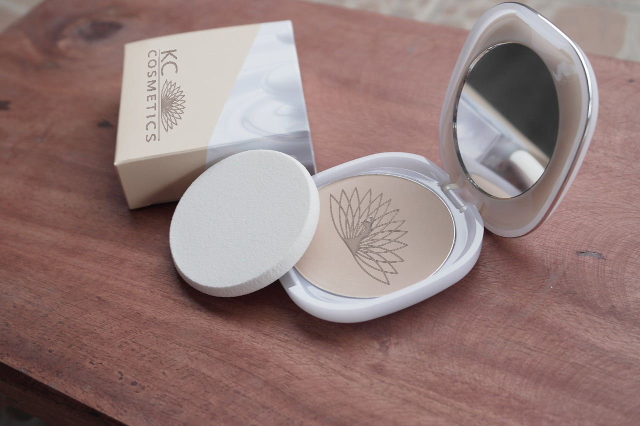
For KC Cosmetics' logo, the peacock serves as a stunning and fitting symbol. Known for its elegance and vibrant colors, the peacock embodies beauty, confidence, and sophistication—qualities that align perfectly with a cosmetics brand. The logo design will focus on a simplified, stylized version of the peacock, capturing the essence of its feathers without overwhelming detail. This approach honors the “simplicity” pillar of logo design, allowing the peacock to symbolize KC Cosmetics’ commitment to high-quality, visually striking products that enhance natural beauty.
In designing the combination mark, I’ll ensure adaptability across different formats, from small product labels to large-scale advertising, without losing the unique visual impact of the peacock. The typeface choice will complement the icon, with a clean and modern font that balances the elaborate beauty of the peacock. Additionally, I’ll select a limited color palette inspired by the rich hues of the peacock’s feathers, giving the logo a luxurious and cohesive appearance. This refined, adaptable logo will represent KC Cosmetics as a brand that celebrates individuality and self-expression.
Project Information
- Category Graphic Design
- Client Meshelle Baker - UALR
- Project date 11 February, 2024
- Final Grade A


